
Visualizing the South is designed to build shared understanding of the region.
By mapping outcomes, highlighting patterns, and creating interactive dashboards, Visualizing the South presents the region as more than a collection of deficits and a place of community, local strength, and real opportunity for progress.
This month’s Visualizing the South explores nonprofit density in the United States. One of the indicators of a community’s resilience is how many nonprofits are located there. Nonprofits provide us with opportunities to give or receive help, bind us together, and help us weather crises ranging from natural disasters to economic downturns to pandemics.
This tool uses IRS 990 filings to map where nonprofits are registered across the country. You can explore how nonprofit availability varies across states, compare categories like housing and education, and see which types of organizations are most common in different places.
But it’s worth slowing down before drawing big conclusions.
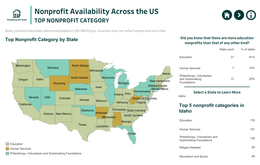
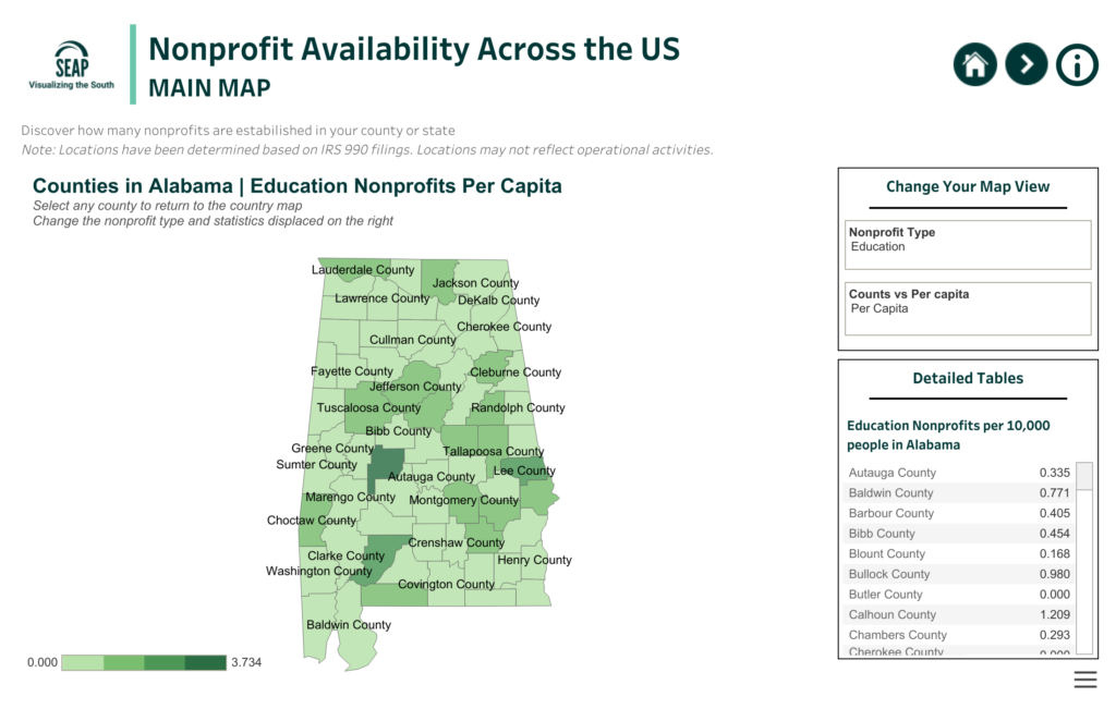
IRS data shows where an organization is registered – not necessarily where it operates or delivers services. A nonprofit based in one state may be working across several others. Smaller or grassroots groups may also be missing from the data if they don’t file a 990. And while per capita measures make comparisons easier, they don’t reflect differences in need, funding, or reach.
So what does this map offer? A starting point for understanding the nonprofit landscape: where organizations are concentrated and how priorities show up across the region.
What doesn’t it show? Whether communities have enough support, whether services are easy to access, or whether resources line up with need.

As you explore, we hope this raises as many questions as it answers. What might be missing—and what would help fill in the gaps?
Data: IRS 990 filings